Introduction
Mixing patterns in home decor can elevate a space from ordinary to unforgettable. When done right, it creates depth, character, and a professionally curated aesthetic. While it might seem intimidating at first, understanding the fundamentals can make you confident in creating dynamic, stylish interiors. This guide will help you master the art of mixing patterns like a true home decor pro.
1. Understanding the Basics of Pattern Mixing
1.1 What Are Patterns in Home Décor?
Patterns are recurring designs or motifs used in fabrics, wallpapers, and accessories. These include geometric shapes, floral prints, stripes, polka dots, and abstract designs. They bring personality and visual interest to interiors.
Common types of patterns:
- Geometric: Squares, triangles, chevrons
- Organic: Florals, leaves, natural elements
- Abstract: Free-form, artistic designs
- Animal Prints: Zebra, leopard, snake
- Stripes and Checks: From pinstripes to buffalo checks
Understanding these helps identify compatible combinations. Mixing patterns isn’t about throwing different prints together—it’s about harmony and balance.
1.2 Why Pattern Mixing Matters
Mixing patterns is essential for creating layered, dynamic spaces. A room full of solids can feel flat, while well-mixed patterns offer:
- Visual stimulation
- Focal points
- Personal expression
- Depth and richness
When done with intention, pattern mixing transforms your decor into a cohesive design statement that reflects your unique taste.
2. Principles of Pattern Mixing
2.1 The Rule of Three
A foundational rule in pattern mixing is the “Rule of Three.” Use three different patterns that vary in:
- Scale (large, medium, small)
- Style (floral, geometric, stripe)
- Color palette (complementary or analogous)
For example:
- Large-scale floral drapes
- Medium-scale striped pillows
- Small polka-dot throws
This approach ensures balance without visual chaos.
2.2 Balance Through Color and Scale
Consistency in color helps unify diverse patterns. Choose a base color and allow it to reappear across patterns. This can be done by:
- Repeating one dominant hue
- Using shades and tints of a color family
- Anchoring patterns with neutral tones
Example Table: Pattern Coordination by Color
| Pattern Type | Color | Common Pairing |
|---|---|---|
| Floral | Blue | Stripes, checks |
| Geometric | Grey | Solids, polka |
| Abstract | Green | Animal prints |
Scale is equally important. Combine:
- One large-scale pattern (eye-catching)
- One medium-scale (supporting)
- One small-scale (filler)
This hierarchy ensures no single pattern overwhelms the others.
3. Practical Application in Different Rooms
3.1 Living Room
In a living room, patterns can be introduced through:
- Throw pillows
- Area rugs
- Curtains
- Wall art
Pattern Tips for Living Rooms:
- Start with a patterned rug as your foundation.
- Add pillows in varying prints but similar tones.
- Use curtains to complement but not overpower other patterns.
Example:
- Persian-style rug (large-scale)
- Stripe pillows (medium)
- Houndstooth throw (small)
3.2 Bedroom
Bedrooms benefit from calm, cohesive pattern mixing.
Ways to mix:
- Layered bedding with stripes and florals
- Upholstered headboards in neutral prints
- Accent wall with subtle wallpaper
Stick to a soft color palette to maintain relaxation while adding interest.
3.3 Kitchen and Dining Areas
These spaces can be tricky due to functional constraints. Use patterns in:
- Table linens
- Backsplashes
- Seat cushions
Pro tip:
- Mix checked napkins with floral centerpieces and solid dishware.
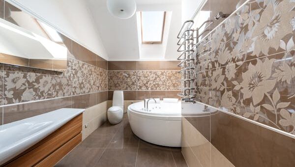
3.4 Bathrooms
Limited space doesn’t mean limited creativity. Use patterned tiles or shower curtains to add life. Balance bold tiles with solid-colored towels or minimal accessories.
3.5 Home Office
Create an inspiring workspace using pattern:
- Wallpaper or decals
- Patterned desk accessories
- Curtains or cushions
Choose energizing yet non-distracting patterns like pinstripes or light geometrics.
4. Advanced Techniques for Mixing Patterns
4.1 Layering Textures and Patterns
Texture adds depth alongside pattern. For example:
- Combine a velvet geometric cushion with a cotton floral throw.
- Use woven rugs against patterned tiles.
Textures act as visual breathing room, preventing pattern overload.
4.2 Using Neutrals as Anchors
Neutrals like beige, grey, white, or black offer a grounding effect. They:
- Tone down busier patterns
- Provide contrast
- Enhance pattern clarity
Incorporate neutrals in walls, large furniture, or flooring.
4.3 Pattern Flow and Repetition
Ensure patterns don’t clash by repeating them:
- Echo a pattern from one pillow to a lampshade
- Repeat a motif in art and rugs
Repetition builds familiarity and consistency.
5. Common Mistakes and How to Avoid Them
5.1 Overloading with Bold Prints
Too many bold patterns can overwhelm a room. Avoid this by:
- Limiting bold prints to one or two statement items
- Using softer or smaller prints to balance
5.2 Ignoring Color Harmony
Clashing colors ruin cohesion. Create a mood board with your color and pattern choices before implementation.
5.3 Lack of Focal Point
Every room needs a focal point. Whether it’s a patterned rug or bold wallpaper, build other patterns around it.
Example Focal Point Strategy:
| Element | Pattern Type | Focal Point Role |
| Rug | Geometric | Grounding element |
| Curtains | Floral | Vertical visual interest |
| Pillows | Abstract | Accents around focal piece |
Conclusion: Start Mixing With Confidence
Mixing patterns in home decor is part science, part art. Start small, experiment with combinations, and trust your instincts. Keep in mind the principles of scale, color, and style, and don’t be afraid to try unexpected pairings. Your home is a canvas, and patterns are your palette.
Ready to take the plunge? Try mixing three patterns in your living room this week and share your favorite combinations online or with fellow design enthusiasts. Let us know how it turned out!
Join the conversation: What’s your favorite pattern mix? Comment below or tag your designs with #PatternProStyle!