Introduction
Designing or remodeling a kitchen can be both exciting and overwhelming. Color plays a crucial role in setting the tone and style of your space. While trends come and go, some kitchen color schemes have stood the test of time. These classic combinations offer longevity, charm, and adaptability, ensuring your kitchen always looks fresh and sophisticated.
This comprehensive guide will explore kitchen color schemes that never go out of style. We’ll discuss why they work, how to incorporate them, and provide practical tips to help you design a kitchen that remains beautiful for years to come.
1. Classic White Kitchens
The Allure of White
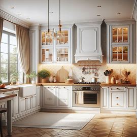
White kitchens are synonymous with cleanliness, brightness, and timelessness. This neutral color acts as a blank canvas, allowing you to personalize with accessories, textures, or pops of color. From modern minimalist styles to traditional farmhouses, white works with virtually every design aesthetic.
Ways to Style a White Kitchen
- Use varying shades of white (ivory, cream, eggshell) to add depth
- Incorporate natural wood tones for warmth
- Use matte or gloss finishes to reflect light differently
| Elements | Recommended Choices |
|---|---|
| Cabinets | Shaker-style white or off-white |
| Countertops | Marble, quartz, or butcher block |
| Backsplash | White subway tile or textured tiles |
Why It’s Timeless
- Easy to update with new hardware or decor
- Makes smaller kitchens feel more spacious
- Appeals to homebuyers due to its universal appeal
2. Neutral Tones: Grays, Beiges, and Taupes
The Versatility of Neutrals
Neutral tones provide a serene, adaptable foundation for kitchen design. Grays, beiges, and taupes are sophisticated and calming, pairing well with most materials, including wood, metal, and stone.
Design Tips for Neutrals
- Layer different neutral shades for contrast
- Mix matte and shiny surfaces for texture
- Add bold accents (e.g., navy or forest green) to keep things lively
Example Neutrals Palette:
- Cabinets: Warm greige
- Walls: Soft dove gray
- Backsplash: Taupe ceramic tile
- Floor: Weathered wood or stone-look tile
Why It’s Timeless
- Adapts well to changing trends
- Provides a calming, elegant atmosphere
- Easily refreshed with seasonal decor or accent colors
3. Two-Tone Kitchens
The Beauty of Contrast
Two-tone kitchen color schemes add visual interest and dimension. This approach often involves using darker lower cabinets and lighter uppers or mixing cabinetry colors with contrasting islands. The result is a balanced and engaging look that maintains long-lasting appeal.
Design Ideas
- Navy blue lower cabinets with white uppers
- Charcoal gray island with soft beige cabinets
- Forest green base cabinets with light oak accents
Popular Two-Tone Combos:
| Top Cabinets | Bottom Cabinets | Island Color |
| White | Navy Blue | Walnut |
| Cream | Charcoal Gray | Pale Sage Green |
| Light Gray | Black | Natural Wood |
Why It’s Timeless
- Adds personality without overwhelming
- Allows for easy updates by repainting only one element
- Harmonizes well with different countertop and flooring materials
4. Earthy and Nature-Inspired Palettes
The Connection to Nature
Earthy tones bring warmth and a sense of groundedness to the kitchen. Think terracotta, moss green, soft browns, and muted blues. These colors evoke nature, providing a comforting and cozy atmosphere that never feels out of style.
Styling Earthy Colors
- Pair olive green cabinets with brass hardware
- Use terracotta tile or paint for a rustic Mediterranean look
- Combine clay-colored walls with wooden shelving and stone counters
Inspirational Earthy Kitchen Example:
- Cabinets: Sage green
- Countertops: Butcher block
- Backsplash: Handmade terracotta tile
- Flooring: Natural slate or reclaimed wood
Why It’s Timeless
- Earth tones transcend trends by mimicking natural environments
- Encourages a warm, welcoming space ideal for gatherings
- Pairs effortlessly with natural materials like wood, clay, and stone
5. Bold Yet Balanced: Navy, Black, and Deep Hues
The Drama of Dark Colors
Rich, saturated colors such as navy, black, and forest green add depth and drama. When balanced with lighter elements, these colors bring a sense of sophistication and luxury to kitchens.
How to Use Bold Colors
- Use navy or black on lower cabinets or islands
- Balance with light countertops and backsplashes
- Add metallic accents like brass or chrome for elegance
Dark Kitchen Inspiration:
| Color | Accent Pairings |
| Navy | Gold hardware, white quartz |
| Black | Marble countertops, wood floors |
| Deep Green | Brass fixtures, ivory walls |
Why It’s Timeless
- Bold colors make a stylish statement without looking trendy
- Provides a luxurious backdrop for entertaining
- Works well with both contemporary and classic design elements
Conclusion: Design a Kitchen That Stands the Test of Time
Choosing a color scheme is one of the most important decisions in kitchen design. By opting for timeless kitchen color schemes, you create a space that remains beautiful, functional, and inviting for years. Whether you prefer a clean white kitchen, a warm neutral palette, a bold two-tone look, or earthy natural tones, these combinations are rooted in design principles that transcend fads.